
Punch & Fruity
Overview
Punch & Fruity is a premium rum brand known for its tropical roots, rich heritage, and strong product quality.
The goal of this project was to modernise the brand identity and packaging system—creating a fresh, contemporary look that would appeal to new customers while preserving the authenticity and personality that existing customers already trusted.
The challenge was not simply to redesign the visuals, but to reposition the brand in a crowded market where shelf presence, storytelling, and emotional connection are critical to purchase decisions.
Brand Strategy
Rebranding
Web Design
Design
Graphic Design
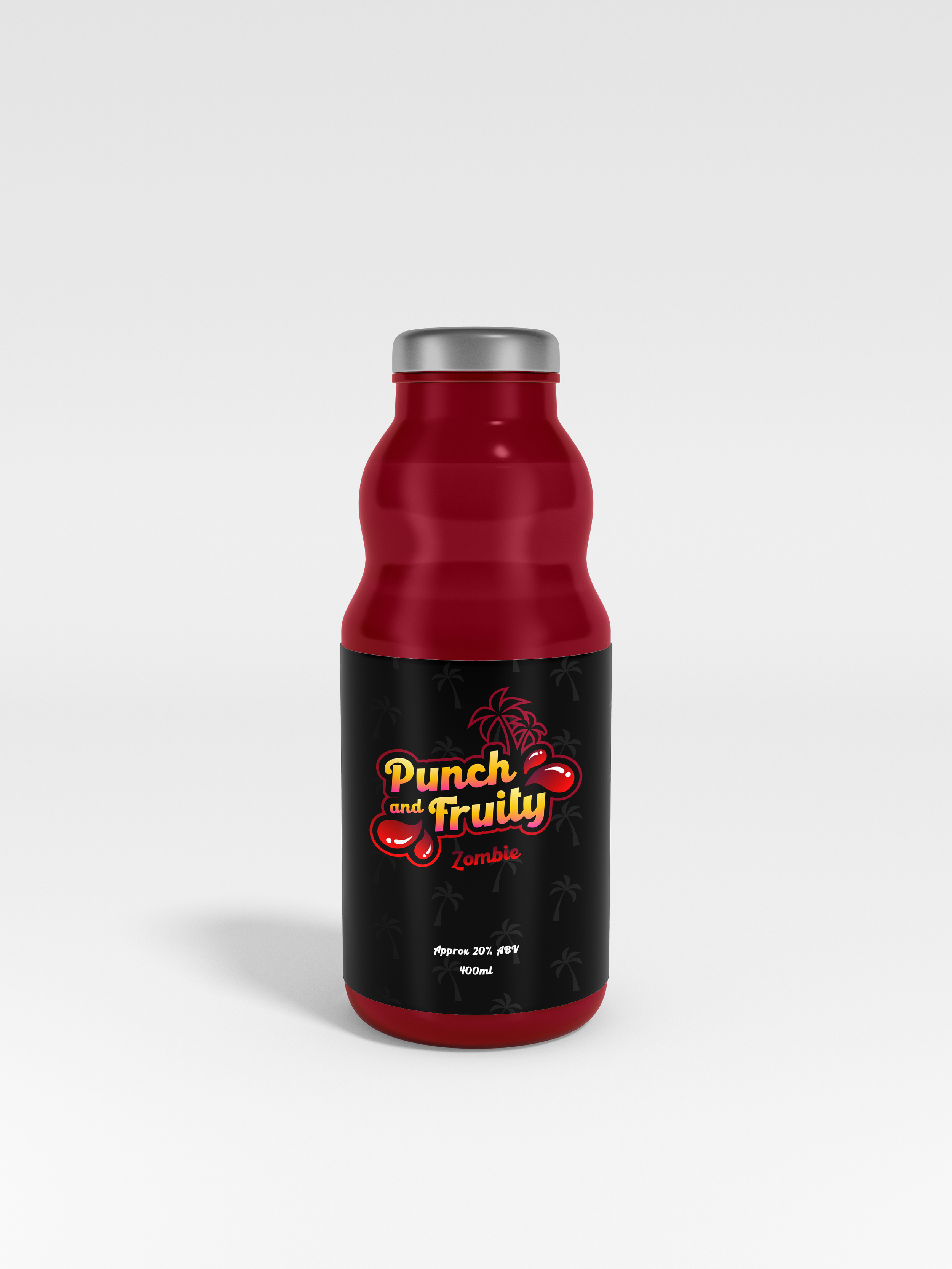
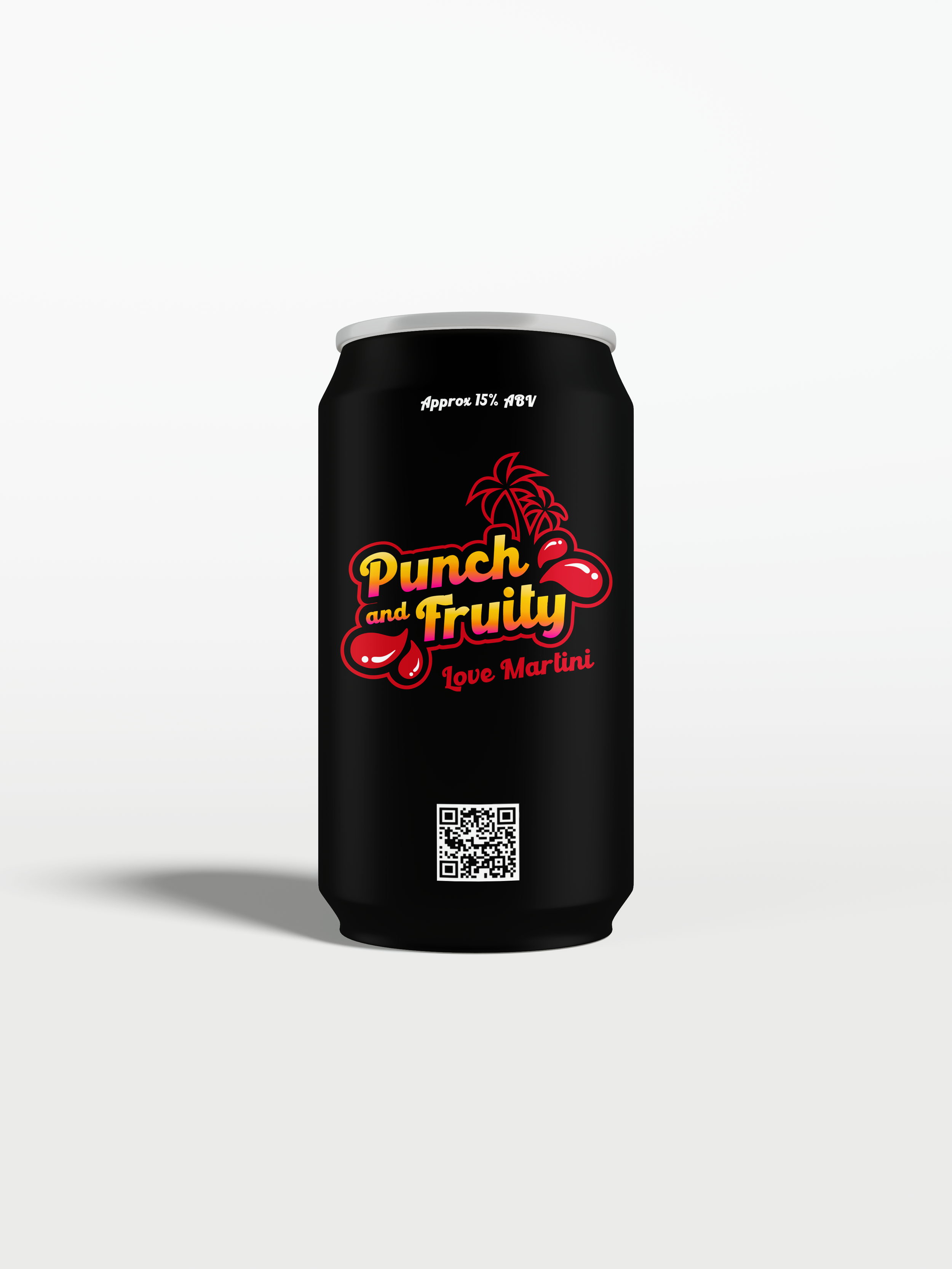
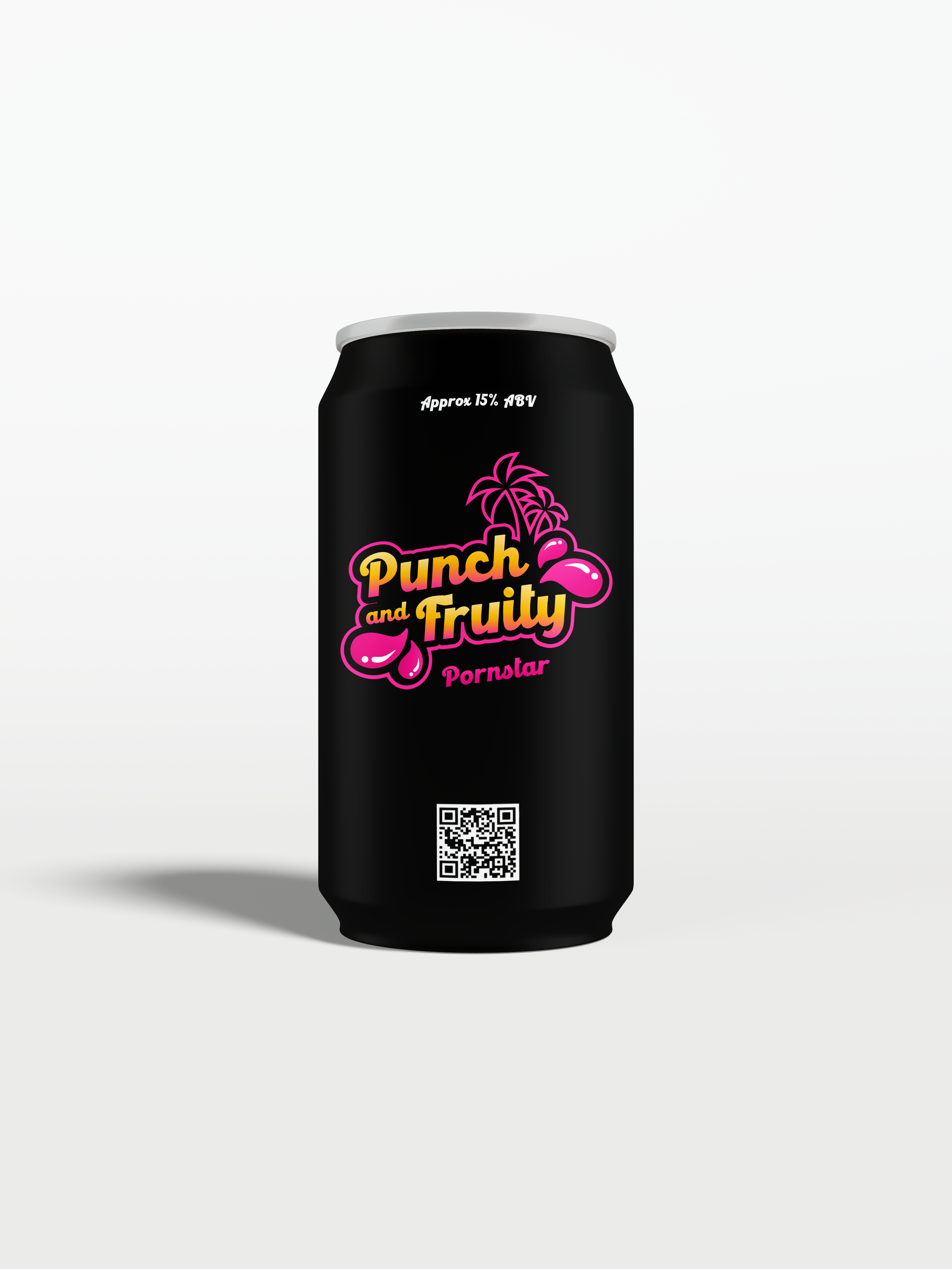
Packaging


My Role
I led the creative direction across the full rebrand, including brand strategy, identity design, packaging design, visual language, and supporting digital assets.
This involved translating the brand’s heritage into a more modern and commercially effective visual system—one that felt premium, memorable, and capable of standing out across both retail and digital environments.
I worked closely with the founder to ensure the new identity balanced business goals, customer perception, and long-term brand growth.


The Challenge
The existing brand lacked the visual impact needed to compete effectively within a highly saturated spirits market.
It needed stronger shelf presence, clearer differentiation, and a more cohesive brand story that reflected both the quality of the product and the personality behind it.
The challenge was finding the right balance between tradition and modernity—keeping the tropical heritage and authenticity of the brand while making it feel more relevant to a younger, design-conscious audience.
Approach
The process began with competitor research, customer positioning, and understanding how premium rum brands were communicating visually across packaging and retail.
From there, I developed a new visual identity built around stronger emotional recognition and clearer differentiation.
This included:
refreshed logo design
a bold tropical-inspired colour palette
refined typography
packaging design with stronger shelf presence
supporting brand assets across marketing and digital touchpoints
The visual language was designed to feel playful, vibrant, and premium—capturing both the energy of the product and the craftsmanship behind it.
Outcome
The rebrand significantly improved product visibility and shelf presence, helping the brand stand out more effectively in retail environments.
It strengthened customer recognition, improved engagement across marketing channels, and supported stronger commercial confidence for future growth.
Most importantly, it gave the business a clearer, more premium identity that felt aligned with both the product quality and the ambition of the brand. The current page also notes increased brand recognition, enhanced shelf presence, stronger engagement, and positive client feedback tied to sales uplift.
Solution
The final identity introduced a more confident and recognisable brand presence, using bold colours, distinctive visual elements, and packaging that better reflected the product’s premium quality.
The updated design helped position Punch & Fruity as both approachable and elevated—maintaining its tropical personality while creating a stronger sense of trust and quality for new customers.
Every touchpoint, from packaging to marketing materials, now worked together as a cohesive brand experience.
“Working with Digitalrocky was a transformative experience. They took the time to understand our history and vision, creating a brand identity that truly represents who we are.”